CB7Tuner91 Posted November 22, 2022 Share Posted November 22, 2022 (edited) Could they have put any less effort into that main game tile? Such a disappointment with a game im looking forward to. Edited November 22, 2022 by CB7Tuner91 3 Link to comment Share on other sites More sharing options...
Popular Post SnowxSakura Posted November 22, 2022 Popular Post Share Posted November 22, 2022 (edited) Yeah I'm definitely getting the ring vibes from the tile Edited November 22, 2022 by SnowxSakura 6 Link to comment Share on other sites More sharing options...
Popular Post Neme-ita Posted November 22, 2022 Popular Post Share Posted November 22, 2022 Who cares mate important is the games IMHO 14 Link to comment Share on other sites More sharing options...
DividedByMankind Posted November 22, 2022 Share Posted November 22, 2022 Cant please everyone! 3 Link to comment Share on other sites More sharing options...
Infected Elite Posted November 22, 2022 Share Posted November 22, 2022 7 minutes ago, SnowxSakura said: Yeah I'm definitely getting the ring vibes from the tile 100%. kind of dumb only 27 trophies, some look easy but we shall see. 1 Link to comment Share on other sites More sharing options...
starcrunch061 Posted November 22, 2022 Share Posted November 22, 2022 I thought they were going for some Dark Souls vibe. Link to comment Share on other sites More sharing options...
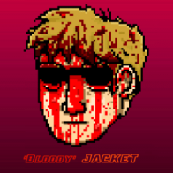
Patrickosan Posted November 22, 2022 Share Posted November 22, 2022 The trophies itself looks really nice. Like the design. 2 Link to comment Share on other sites More sharing options...
CB7Tuner91 Posted November 22, 2022 Author Share Posted November 22, 2022 @Neme-ita First it has nothing to do with how good the game is, but the lack of effort on the tile. Not everyone is the same as you man. 1 Link to comment Share on other sites More sharing options...
Profeelgood Posted November 22, 2022 Share Posted November 22, 2022 (edited) I feel like you can't judge a title of something until you finish the story. Cause it might make way more sense after some point in the story, but sounds weird or mysterious at first. I mean of course you CAN judge something right off the bat. But its a little to quick and rash. Edited November 22, 2022 by Profeelgood 2 Link to comment Share on other sites More sharing options...
HoorayForTyler Posted November 22, 2022 Share Posted November 22, 2022 The game tile is pretty uninspired, but the trophy images themselves are very nice. I’m more surprised that there’s less than 30 trophies for a title this big. 3 Link to comment Share on other sites More sharing options...
yowzagabowza Posted November 22, 2022 Share Posted November 22, 2022 (edited) I thought it was like, an eclipse of some sort. Aren't we on a Jovian moon in this game? Seems to make sense to me. Also, I don't care about the game tile. Edited November 23, 2022 by yowzagabowza Link to comment Share on other sites More sharing options...
Fr_0zt Posted November 22, 2022 Share Posted November 22, 2022 Aye but let me cheer you lot up with this absolute banger! 2 Link to comment Share on other sites More sharing options...
TrophyChief Posted November 23, 2022 Share Posted November 23, 2022 (edited) 6 hours ago, Fr_0zt said: Aye but let me cheer you lot up with this absolute banger! Score matched up with the launch trailer. Gets you in the vibe... Edited November 23, 2022 by TrophyChief 1 Link to comment Share on other sites More sharing options...
Popular Post FreshFromThaDeli Posted November 23, 2022 Popular Post Share Posted November 23, 2022 Of all things to complain about... 11 Link to comment Share on other sites More sharing options...
ScintillaWolf Posted November 23, 2022 Share Posted November 23, 2022 2 hours ago, HoorayForTyler said: The game tile is pretty uninspired, but the trophy images themselves are very nice. I’m more surprised that there’s less than 30 trophies for a title this big. Might be a case like the first Last of Us, they don't want your experience or gameplay to be dictated by the trophies? I do agree that the trophies look nice though, whilst the main tile looks pretty dreadful. Link to comment Share on other sites More sharing options...
Popular Post diskdocx Posted November 23, 2022 Popular Post Share Posted November 23, 2022 Am I looking at something different that this thread refers to? The tile on this site for the game looks great. 9 Link to comment Share on other sites More sharing options...
ChibsSoA Posted November 23, 2022 Share Posted November 23, 2022 (edited) Part of me wants to rent this bc if a playthrough is 12-14 hours, that's no more than a week long plat even with hard mode thrown in. For $70 that's not a lot of bang for your buck. On the other hand I want to support it. But I'm not the type to be dropping $70 on a 25-30 hour plat vs just renting bc it's such a snack that'll be over so fast... ugh! Edited November 23, 2022 by ChibsSoA Link to comment Share on other sites More sharing options...
Popular Post majob Posted November 23, 2022 Popular Post Share Posted November 23, 2022 (edited) The tile is Callisto during a solar eclipse. That's pretty relevant to the game I'd say https://ibb.co/LpyWptq Edited November 23, 2022 by majob 7 Link to comment Share on other sites More sharing options...
HoorayForTyler Posted November 23, 2022 Share Posted November 23, 2022 51 minutes ago, ScintillaWolf said: Might be a case like the first Last of Us, they don't want your experience or gameplay to be dictated by the trophies? That’s actually a really good point. Less focus on the trophies, more focus on the potentially great gameplay experience. Link to comment Share on other sites More sharing options...
Markemmanuel Posted November 23, 2022 Share Posted November 23, 2022 (edited) The eclipse mark is also the "o" in the game title. It doubles as a monogram. It's visceral, emotive, mysterious. Those all sound in line with the game. It takes a higher level approach to branding than the expected "protagonist on tile" design. Source; design director Edited November 23, 2022 by Markemmanuel 3 Link to comment Share on other sites More sharing options...
EightBitArtist Posted November 23, 2022 Share Posted November 23, 2022 i remember a dev talking about how there was going to be a trophy for seeing every death animation in the game. glad they got rid of that. id hate to have to constantly die on purpose for all the death animations. 1 Link to comment Share on other sites More sharing options...
Skurkitty Posted November 23, 2022 Share Posted November 23, 2022 Can't say I've honestly ever given a shit about the main tile or the trophy art / names. I'm buying the game to play the game (and collect trophies), the tile/trophy art does not impact the game in any way. To each their own but I've never been looked back at my list and thought "Damn that small token art is outstanding". Instead I remember my experiences with the game. Link to comment Share on other sites More sharing options...
falsaai Posted November 23, 2022 Share Posted November 23, 2022 I thought it’s Outraiders, and it’s absolutely horrible. I get really surprised when I see creative games with horrible tiles; Hades, Sifu, this game and many others. 1 Link to comment Share on other sites More sharing options...
papert0wng1rl Posted November 23, 2022 Share Posted November 23, 2022 To people who appreciate art and design, these tiles are pretty disappointing. And why wouldn't it be disappointing? Art is an integral part of marketing. The design is supposed to draw you to the product. It makes little sense to have an image that lacks a title and feels off in proportions. You can take the same image of the eclipse and make it look like professional design. I think all PS5 tiles should just be retail images of the cover art. But as mentioned before, those trophy images are really nice. 2 Link to comment Share on other sites More sharing options...
TheNarrator Posted November 23, 2022 Share Posted November 23, 2022 (edited) Always prefer a trophy tile to not include the title of the game in it. Would say having the title of a game in it is actually more lazy, as anyone can just paste that in there and be done lol. Though this one is a bit too much on the simple side too, but if thats all part of the games design, then it makes sense. Edited November 23, 2022 by TheNarrator 2 Link to comment Share on other sites More sharing options...
Recommended Posts
Create an account or sign in to comment
You need to be a member in order to leave a comment
Create an account
Sign up for a new account in our community. It's easy!
Register a new accountSign in
Already have an account? Sign in here.
Sign In Now