Dav9834 Posted January 5, 2017 Share Posted January 5, 2017 1 hour ago, Dragon-Archon said: Feel free to take on any of the other pending requests from the OP. Hmm I'll see what I can do this weekend. But ya it seems your swamped. At least you remembered to vote in Song Vote before it ended. Doesn't look good for a member not to vote!! You aren't happening to be gaming intensely to win your January contest Link to comment Share on other sites More sharing options...
Dragon-Archon Posted January 5, 2017 Author Share Posted January 5, 2017 8 minutes ago, Dav9834 said: Hmm I'll see what I can do this weekend. But ya it seems your swamped. At least you remembered to vote in Song Vote before it ended. Doesn't look good for a member not to vote!! You aren't happening to be gaming intensely to win your January contest I'm not participating in the contest, my username isn't even on the participant list. That's strike two, one more mistake and you can go up 6 places on the list . 1 Link to comment Share on other sites More sharing options...
Dav9834 Posted January 5, 2017 Share Posted January 5, 2017 1 minute ago, Dragon-Archon said: I'm not participating in the contest, my username isn't even on the participant list. That's strike two, one more mistake and you can go up 6 places on the list . Link to comment Share on other sites More sharing options...
Dragon-Archon Posted January 6, 2017 Author Share Posted January 6, 2017 On 12-12-2016 at 5:46 PM, Alternatewarning said: Hm, if anyone is still up to making more I'd love one. My own artistic talents are...well you can see how simple my icon is. Maybe something from Kingdom Hearts? I love the ascetic of the keyblades, the cool ones not the Disney ones. Which basically means the ones that look more "metal" Edit: I've been asked to specify: Kingdom Key, Oathkeeper, Oblivion, Ultima Weapon, Pumpkinhead, Lionheart, Diamonddust, One Winged Angel, Stormfall, Skull Noise, ones like those. I also like the look of all the keys in the keyblade graveyard. Whew, this one took a lot of time. Tried many, many possibilities and restarted lots of times. What do you think? 4 Link to comment Share on other sites More sharing options...
Alternatewarning Posted January 6, 2017 Share Posted January 6, 2017 3 hours ago, Dragon-Archon said: Whew, this one took a lot of time. Tried many, many possibilities and restarted lots of times. What do you think? WAAAAHHHH it looks fantastic! Thank you SO MUCH Dragon! Link to comment Share on other sites More sharing options...
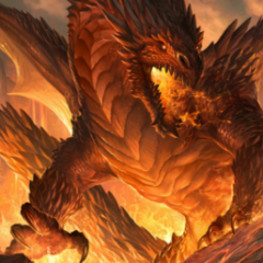
Dragon-Archon Posted January 6, 2017 Author Share Posted January 6, 2017 1 hour ago, Alternatewarning said: WAAAAHHHH it looks fantastic! Thank you SO MUCH Dragon! I'm glad that you like it . Enjoy your own private keyblade graveyard. Btw can you tell how many and which keyblades are in the image? Link to comment Share on other sites More sharing options...
Alternatewarning Posted January 7, 2017 Share Posted January 7, 2017 15 hours ago, Dragon-Archon said: I'm glad that you like it . Enjoy your own private keyblade graveyard. Btw can you tell how many and which keyblades are in the image? Of course...once I replay all the games and remember all the names... But I do see One Winged Angel, Ultima, Metal Choocobo, Oathkeeper, Oblivion, Lionheart and a whole lot of keysblades that I honestly don't remember what their names are. But I think I count 27 Link to comment Share on other sites More sharing options...
Dragon-Archon Posted January 7, 2017 Author Share Posted January 7, 2017 3 hours ago, Alternatewarning said: Of course...once I replay all the games and remember all the names... But I do see One Winged Angel, Ultima, Metal Choocobo, Oathkeeper, Oblivion, Lionheart and a whole lot of keysblades that I honestly don't remember what their names are. But I think I count 27 Lol . Close, there are 28 of them. Link to comment Share on other sites More sharing options...
Dav9834 Posted January 7, 2017 Share Posted January 7, 2017 On 1/4/2017 at 7:18 PM, Dragon-Archon said: Feel free to take on any of the other pending requests from the OP. I'm really not familiar with the games on the waiting list.... Link to comment Share on other sites More sharing options...
Dragon-Archon Posted January 8, 2017 Author Share Posted January 8, 2017 7 hours ago, Dav9834 said: I'm really not familiar with the games on the waiting list.... Ok, btw do you want to be added to the OP as an artist? Link to comment Share on other sites More sharing options...
Dragon-Archon Posted January 12, 2017 Author Share Posted January 12, 2017 On 14-12-2016 at 2:07 AM, Mar said: Of course the image was an example. The artist naturally would resize it haha. But this is actually what I want, now Cover Photo: Reveal hidden contents Requested Edits for CP: Jak and Daxter logo removed from center and replaced by the new MAR text instead (symbolizing my profile). A light'ish gold tint/aura like design placed behind Mar's name, complimenting it, like how the SS and SSG forms golden outlines compliment the transformations, and the same with the Seal of Mar in Jak II ('during a cycle phrase'). Jak and Daxter Logo re-sized and reinserted at the bottom right half corner (symbolizing this is a JnD theme cover photo). Jak and Daxter Logo frontal characters recolored to match the Precursor Metal engraved Precursor Alphabets (Maybe the Mar text to, but I want to see how it'd look naturally first). It's not finished yet, but I need your help. Which text do you prefer? 1 Link to comment Share on other sites More sharing options...
Jak Posted January 12, 2017 Share Posted January 12, 2017 (edited) 1 hour ago, Dragon-Archon said: It's not finished yet, but I need your help. Which text do you prefer? The orange and other colors seem out of place, so Ill go with the original (natural) color, which was the JaD shade/color, but equipped with Mar. (Plus gold tint.) The M is a little weird looking to me. Can you slightly pull the legs away from each other so it looks similar to a standard M (but obviously not a direct M clone)? I also prefer the background metal of the original image, since it looks moreso like a real in in-universe precursor object. Tl;dr: Literally just want a "Mar" version of the template-picture I posted, but with the addition of a golden tint complimenting the (legendary) name, and JaD logo on the bottom side : > Edited January 12, 2017 by Mar Link to comment Share on other sites More sharing options...
Dragon-Archon Posted January 12, 2017 Author Share Posted January 12, 2017 5 hours ago, Mar said: The orange and other colors seem out of place, so Ill go with the original (natural) color, which was the JaD shade/color, but equipped with Mar. (Plus gold tint.) The M is a little weird looking to me. Can you slightly pull the legs away from each other so it looks similar to a standard M (but obviously not a direct M clone)? I also prefer the background metal of the original image, since it looks moreso like a real in in-universe precursor object. Tl;dr: Literally just want a "Mar" version of the template-picture I posted, but with the addition of a golden tint complimenting the (legendary) name, and JaD logo on the bottom side : > Oh ok, I thought the orange would resemble the official logo nicely. Here you go: Link to comment Share on other sites More sharing options...
Jak Posted January 12, 2017 Share Posted January 12, 2017 (edited) 14 hours ago, Dragon-Archon said: Oh ok, I thought the orange would resemble the official logo nicely. Here you go: Hmm.. can you town down the golden tint a bit, really in the middle section of the inner name? I pretty much just wanted a golden borderline around the name with subtle golden tint engulfing the entire name. And I literally making all the black lines in the JaD logo, gold. Secondly, can you slightly decrease the size of the JaD logo? Thirdly, could you actually re-add the original border concept of the original image? I don't know the word but it made the image look better. Fourthly, I like what you tried to do with the JaD character insertion into the cover photo, I really do, but if anything, I'd rather have Jak's model from Jak II and Jak 3, or Mar himself. Also, if you could slightly push Mar's name towards the middle, whether you insert a new character model or not. Edited January 13, 2017 by Mar Link to comment Share on other sites More sharing options...
Dragon-Archon Posted January 12, 2017 Author Share Posted January 12, 2017 46 minutes ago, Mar said: Hmm.. can you town down the golden tint a bit, really in the middle section of the inner name? I pretty much just wanted a golden borderline around the name with subtle golden tint engulfing the entire name. And I guess the golden color replacing the precursor color within the letter's 'holes', like the holes you see in A (2) and R (1). Secondly, can you slightly decrease the size of the JaD logo? Thirdly, could you actually re-add the original border concept of the original image? I don't know the word but it made the image look better. I'll see what I can do, though keep in mind that those horizontal lines are semi-transparent, so adding them won't make them match the background. Are you ok with that? 48 minutes ago, Mar said: Fourthly, I like what you tried to do with the JaD character insertion into the cover photo, I really do, but if anything, I'd rather have Jak's model from Jak II and Jak 3, or Mar himself. Also, if you could slightly push Mar's name towards the middle, whether you insert a new character model or not. So 2 images? Link to comment Share on other sites More sharing options...
Jak Posted January 12, 2017 Share Posted January 12, 2017 (edited) 13 minutes ago, Dragon-Archon said: I'll see what I can do, though keep in mind that those horizontal lines are semi-transparent, so adding them won't make them match the background. Are you ok with that? So 2 images? That's fine lol, if it looks like it does in the original image. (You could hardly tell.) Wait, why wouldnt it match?? It does in the original. I actually meant *or. What about using that statue picture I sent in the other sig thread, or "the kid"? Edited January 12, 2017 by Mar Link to comment Share on other sites More sharing options...
Dragon-Archon Posted January 12, 2017 Author Share Posted January 12, 2017 (edited) 1 hour ago, Mar said: Wait, why wouldnt it match?? It does in the original. What about using that statue picture I sent in the other sig thread, or "the kid"? Because I'm not using the entire original image, just parts of it. The original image had a huge logo in the center and the background has lighter and darker areas mixed together. Just pasting another part over it to cover it up looks hideous. Then there's also the radial colour gradient where it's brighter in the center and darker at the edges of the image. Besides that, the original image only has a width of 1024 pixels, while cover images have a width of 1270. That image isn't rendered. Same with the kid. Edited January 12, 2017 by Dragon-Archon 1 Link to comment Share on other sites More sharing options...
Jak Posted January 12, 2017 Share Posted January 12, 2017 54 minutes ago, Dragon-Archon said: Because I'm not using the entire original image, just parts of it. The original image had a huge logo in the center and the background has lighter and darker areas mixed together. Just pasting another part over it to cover it up looks hideous. Then there's also the radial colour gradient where it's brighter in the center and darker at the edges of the image. Besides that, the original image only has a width of 1024 pixels, while cover images have a width of 1270. That image isn't rendered. Same with the kid. Ok, but the extra horizontal lines shouldnt be an issue, color wise (even while semi transparent), right? Simple copy-color-pasta (whether original or the re-coloring youve done elsewhere on tbe pic) if necessary? Doesnt the same apply to the JaD photo you inserted? Unless you mean something else by rendered... Link to comment Share on other sites More sharing options...
ruffedgz Posted January 12, 2017 Share Posted January 12, 2017 1 hour ago, Dragon-Archon said: That image isn't rendered. Same with the kid. here you go 2 Link to comment Share on other sites More sharing options...
Jak Posted January 13, 2017 Share Posted January 13, 2017 5 hours ago, ruffedgz said: here you go You sir deserve some acknowledgement for this, well done. However, me personally, I was considering the other Mar Statue, purely because its horizontal heavy, which would make it fit well within a banner-like image, whereas this one is more vertical heavy which wont work out too nicely (right?) Also, shouldnt the stone stand hes standing on be rendered to? Look how weird he looks without it Link to comment Share on other sites More sharing options...
ruffedgz Posted January 13, 2017 Share Posted January 13, 2017 3 minutes ago, Mar said: You sir deserve some acknowledgement for this, well done. However, me personally, I was considering the other Mar Statue, purely because its horizontal heavy, which would make it fit well within a banner-like image, whereas this one is more vertical heavy which wont work out too nicely (right?) Also, shouldnt the stone stand hes standing on be rendered to? Look how weird he looks without it I dont know what other image you are talking about because on the original post that was linked from the first page showed this one so I did it. renders are usually of the character you are trying to grab and since it is a statue, having the rock there would have probably been ok but its up to the person cutting the render. Just didn't see the need for the rock part as a person who wanted to use might not want it or cover it up anyway... just something I did to help. Best of luck with this request @Dragon-Archon 1 Link to comment Share on other sites More sharing options...
Popular Post DEMON Posted January 13, 2017 Popular Post Share Posted January 13, 2017 (edited) Personally as someone who has done GFX for a long time. I really hate it, find it annoying when requesters want something constantly redone. It's really.. we aren't being paid to do this; it's something we do in our own free time as a hobby. So try and not be too demanding. It ruins the fun and you'll more likely have the artist give up on your request (I have a thing whereas I do one fix and that's it; take it or leave it). You can also do with being much clearer on your request if you had a certain image in mind; you should mention this and make it clear. Honestly best requests are the ones with no restrictions at all; you will get the best work out of these. Anyways, like @ruffedgz said, best of luck with this request @Dragon-Archon. Edited January 13, 2017 by DEMON 6 Link to comment Share on other sites More sharing options...
Jak Posted January 13, 2017 Share Posted January 13, 2017 52 minutes ago, DEMON said: Personally as someone who has done GFX for a long time. I really hate it, find it annoying when requesters want something constantly redone. It's really.. we aren't being paid to do this; it's something we do in our own free time as a hobby. So try and not be too demanding. It ruins the fun and you'll more likely have the artist give up on your request (I have a thing whereas I do one fix and that's it; take it or leave it). You can also do with being much clearer on your request if you had a certain image in mind; you should mention this and make it clear. Honestly best requests are the ones with no restrictions at all; you will get the best work out of these. Anyways, like @ruffedgz said, best of luck with this request @Dragon-Archon. Theres also no point in a request if the artist wont nail the requester's vision or come extremely close to it... it goes both ways, not one. You also cant use your own judgment on the work done to justify that its complete or that the requester is being annoying when they give more feedback after a posted example. Youre designing it how you think the person wants it, you dont know how they want it unless they speak up. Only made worst by the fact were on the internet, so really you should be more forgiving. (Seriously, *ONE* edit?) I was actually pretty clear enough on what I wanted. The (unfinished) samples that he showed me was only half of what I requested (I didnt expect for him to rid the extra lines in the image, as well as keeping the JaD logo as big as he did)... yet its my fault for speaking up about something I wanted, as oppose to accepting what was made for sake of politeness alone? Combined with the fact this would be a long term cover for me, its not like the work would go to waste. That "take what I made and deal with it logic/attitude" is a pretty unwelcoming and repelling requesters' work method. With that said @Dragon-Archon. Apparantly, im warming up'ish to Mar text...., thus leaving the return of those extra lines you got rid of, resizing JaD's logo to be slightly smaller (though making those black outlines - just the black outlines - also gold would be a nice complimentary detail, since it wasnt black before), and simply moving over the Mar text over to the left a tad bit. @ruffedgz Its not that hard :\ (He's almost done.) Link to comment Share on other sites More sharing options...
Dragon-Archon Posted January 13, 2017 Author Share Posted January 13, 2017 (edited) 15 hours ago, Mar said: Doesnt the same apply to the JaD photo you inserted? Unless you mean something else by rendered... Nope, I used this rendered logo for that: Spoiler 15 hours ago, ruffedgz said: here you go Spoiler Thanks a lot for that, I didn't have the time nor the patience to render it. 9 hours ago, ruffedgz said: Best of luck with this request @Dragon-Archon 8 hours ago, DEMON said: Anyways, like @ruffedgz said, best of luck with this request @Dragon-Archon. Thanks guys . 19 hours ago, Mar said: Hmm.. can you town down the golden tint a bit, really in the middle section of the inner name? I pretty much just wanted a golden borderline around the name with subtle golden tint engulfing the entire name. And I literally making all the black lines in the JaD logo, gold. Secondly, can you slightly decrease the size of the JaD logo? Thirdly, could you actually re-add the original border concept of the original image? I don't know the word but it made the image look better. Fourthly, I like what you tried to do with the JaD character insertion into the cover photo, I really do, but if anything, I'd rather have Jak's model from Jak II and Jak 3, or Mar himself. Also, if you could slightly push Mar's name towards the middle, whether you insert a new character model or not. Here you go, I hope you like it: Edited January 13, 2017 by Dragon-Archon 1 Link to comment Share on other sites More sharing options...
Jak Posted January 13, 2017 Share Posted January 13, 2017 7 hours ago, Dragon-Archon said: Nope, I used this rendered logo for that: Reveal hidden contents Thanks a lot for that, I didn't have the time nor the patience to render it. Thanks guys . Here you go, I hope you like it: Holy shit! This actually looks badass, and you nailed the golden aspect pretty much exactly as how I wanted. The colored JaD logo, which I didnt want, actually looks good colored to, though I expected the placement to be lowered towards the corner (small nitpick). And the size of the JaD logo is much more ideal to how I wanted. The Statue piece unexpectedily looks amazing to especially with the matching color scheme. Only issue I see is Mar text getting in the way of a few things. Seems the extra lines helped make this issue. Id like for the text to fit in the middle without overshadowing so much of the good looking cover. Could you combine the lines to the precusor text engraved metal on both sides to regain some middle space for the Mar text to fit more gorcheously? You could make the lines skinner IF necessary. I noticed you have a little extra space left to push the lines up to, so that should further help. And if you could just push/place/drag the JaD text down a bit more to make the text look more "liscenced-like", unless the redone precursor metal frames compliments its current placement. Everything else is good as hell. @Reply. As for the render I was referring to in the other earlier reply, I actually was talking about the character JaD render. The logo itself has a lot of renders out there in general (the collection one is annoying though when placed on everything). Also, I want to say both golden Mar text are actually awesome. In confusing (which I think is caused by the visual difference of mobile and pc/ps4 browser, constantly switching back and fourth) honesty, I think both get my vision across. The original might have a tad bit too much gold in the text itself but I really like that one to. I like both versions, maybe the original a little more, but the new one is good enough. Link to comment Share on other sites More sharing options...
Recommended Posts
Create an account or sign in to comment
You need to be a member in order to leave a comment
Create an account
Sign up for a new account in our community. It's easy!
Register a new accountSign in
Already have an account? Sign in here.
Sign In Now